Cutifying Melbourne's
Metro Trains
This project investigates the potential of using ‘cute’ as an aesthetic strategy to transform certain communications found on Melbourne’s Metro trains. I identified that many of the current print communications on Melbourne’s trains could be classified as “boring.” These signs, despite their importance, often go unnoticed because they lack the ability to engage viewers. This project explores how the incorporation of ‘cute’ elements could enhance the effectiveness and visibility of such communications.
Boring Design in Melbourne Trains
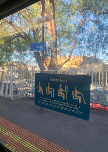
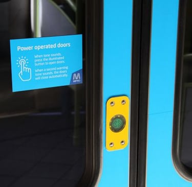
The labels on Melbourne trains embody a "boring" aesthetic—minimalist, small, and unremarkably placed. While necessary for conveying essential information, they often feel like box-ticking exercises, constrained by legal requirements and lacking creativity or emotional resonance.
From a semiotic perspective, this creates an intriguing contradiction: the labels are crucial yet fail to engage viewers, highlighting a tension between function and form. This design dilemma underscores how utilitarian communication can inadvertently evoke indifference.




The Power of the 'Cute' Aesthetic
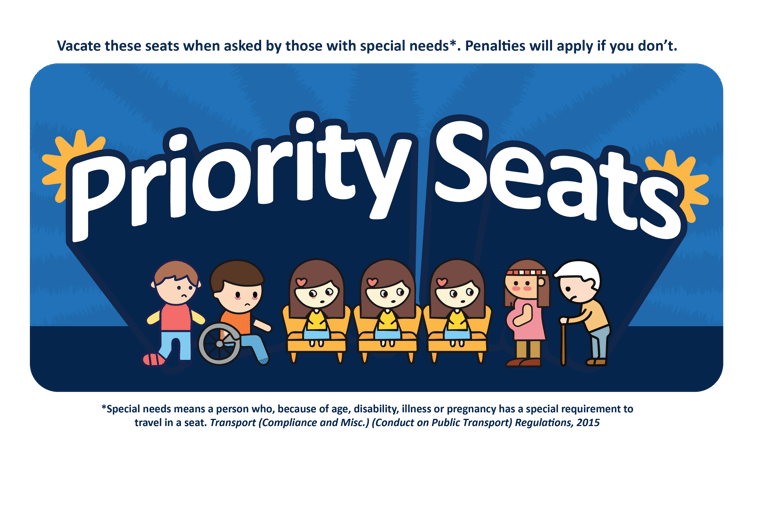
Unlike the 'boring' aesthetic, the 'cute' aesthetic taps into emotional appeal, making visual information more engaging. Inspired by Simon May’s insights, this project explores how 'cute' design—emphasizing child-like qualities—can transform train signage into more attention-grabbing and appealing visuals. By using exaggerated emotional cues, the designs convey both innocence and assertiveness, drawing viewers in and making the mundane more memorable.

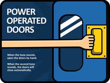
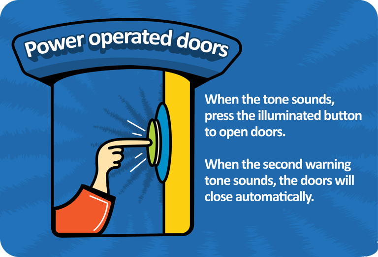

Reflecting on the process, even subtle tweaks—like playful language—can 'cutify' communications without compromising functionality. Some project visuals, while cute, carry darker undertones, creating a mix of innocence and melancholy. This duality, inherent to the 'cute' aesthetic, allows for deeper, complex storytelling.


Ultimately, this project demonstrates how 'cute' can enhance public signage, making everyday communications more engaging and memorable, while respecting the need for clarity in essential information.