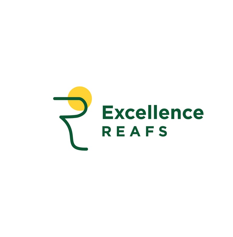
Excellence Reafs
To address the branding needs for Excellence Reafs Private Limited, a company founded in 2020 with a focus on providing exceptional services in the Real Estate and Financial markets, I crafted a distinctive and culturally resonant identity that captures the essence of the brand's mission and Indian context.
Drawing inspiration from the company's commitment to excellence in both real estate and financial services, I developed a brand identity that combines precision, quality, and a nod to Indian cultural symbolism.
Brand Identity Concept:
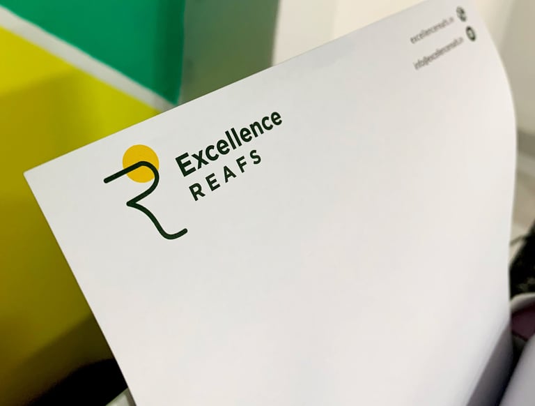
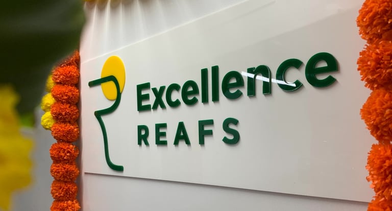
To ensure a visually harmonious and aesthetically pleasing logo, I applied the golden ratio in its design. The golden ratio, a mathematical concept known for its balance and aesthetic appeal, was utilized to create proportions within the logo that are visually engaging and convey a sense of excellence and sophistication.
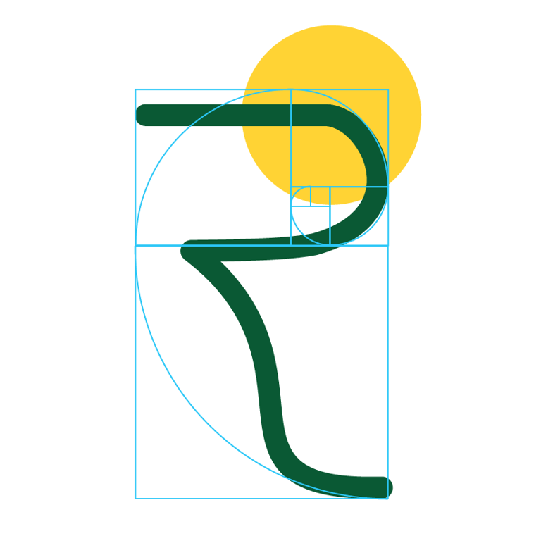
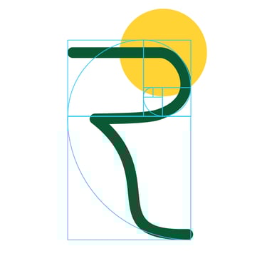
Golden Ratio in the Logo:
The inclusion of the letter 'R' in Devnagari script within the logo adds a distinctive touch, emphasizing the brand's Indian roots. This not only enhances the cultural relevance of the brand but also establishes a connection with the local audience. Additionally, the 'R' in Devnagari script holds significance in the context of the Indian Rupee, linking it directly to the financial market aspect of the brand. This subtle yet powerful association reinforces Excellence Reafs Private Limited's presence and expertise in the financial domain.
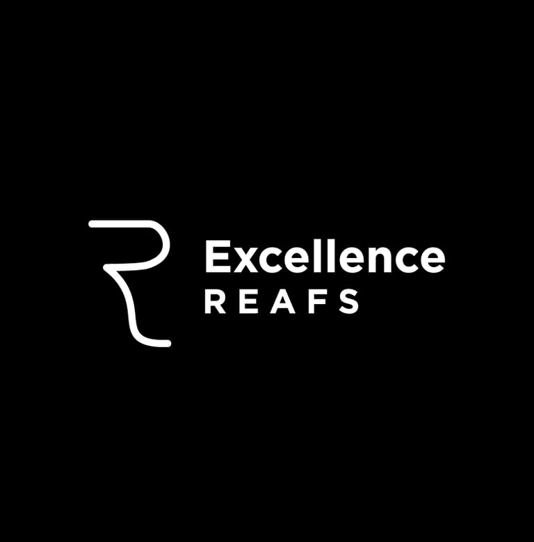
'R' in Devnagari Script:
Incorporating a yellow circle into the logo serves a dual purpose. Firstly, the yellow circle symbolizes the sun, a significant element in Indian cultural context. The sun is often associated with positivity, energy, and auspiciousness. By incorporating this symbol, the logo not only pays homage to cultural elements but also conveys a message of positivity and excellence. The vibrant yellow color adds a touch of warmth and optimism to the brand's visual identity.
Use of Yellow Circle: