Hope Foundation
Designing the brand identity for the 'Hope Foundation,' a non-profit organization dedicated to supporting those who have the sky as their only roof, was a deeply inspiring and meaningful project. The objective was to create a visual representation that conveyed the essence of hope, resilience, and inclusivity.
The core of the brand identity revolves around the concept of hope and the idea of extending a helping hand. The fundamental shapes chosen were two vertical rectangles flanking a curvy smile shape in the middle, forming the letter 'H' for Hope. This design was intentional, symbolizing support and unity within the community.
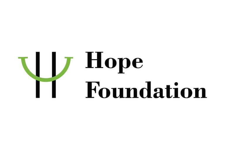
One of the key strengths of this brand identity lies in its extendibility. The smile shape can be extracted and used independently, making it a versatile element for various applications. This allows for creative flexibility in branding materials, enabling the 'Hope Foundation' to maintain a consistent and recognizable visual identity across different platforms.
In addition to the primary logo, guidelines were established for the use of the smile shape as a standalone icon. This allows for easy recognition even without the complete logo, enhancing the brand's visibility and recall value.


Overall, the brand identity for the 'Hope Foundation' is designed to convey a message of compassion, solidarity, and hope. It aims to inspire positive change and reinforce the organization's commitment to making a meaningful impact in the lives of those facing homelessness and adversity.