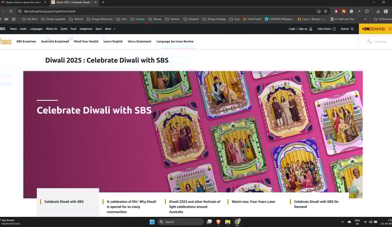
2025 Diwali Campaign: SBS Australia
SBS Australia's team reached out to me with a very clear brief for their Diwali campaign: Illustrate frames and cards that would capture the culture of India, Nepal and Sri Lanka during Diwali.

Thankfully, some of my work was already in their mood-boards!
After some research into Indian traditional aesthetics, I found out that North India and South India have a very different in aesthetic style.
North Indian art is influenced by bold, geometric forms.
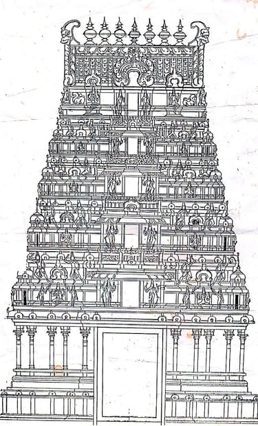
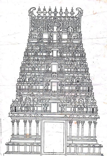
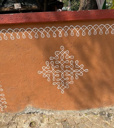
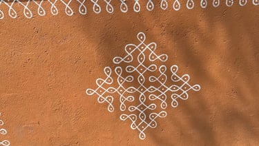
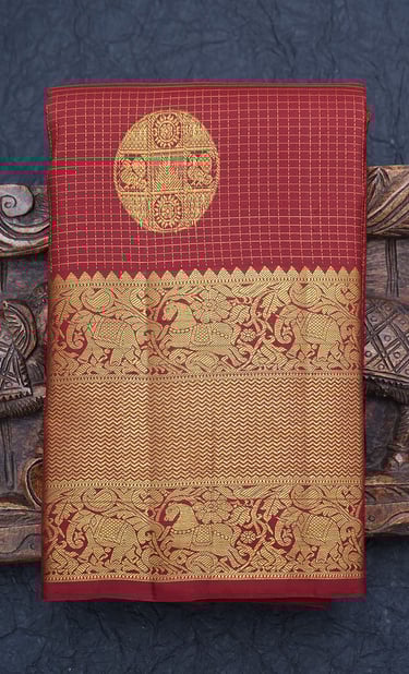
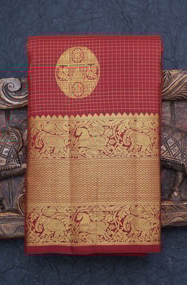
while South Indian art is a lot more 'rounded' and has a heavy influence of gopuram temple architecture. Textiles such as Kanchipuram silk influence it's pattern language.
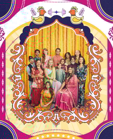
After a lot of sketching and ideation, I illustrated this to capture the essence of a North Indian–style Diwali!

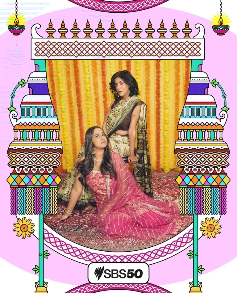
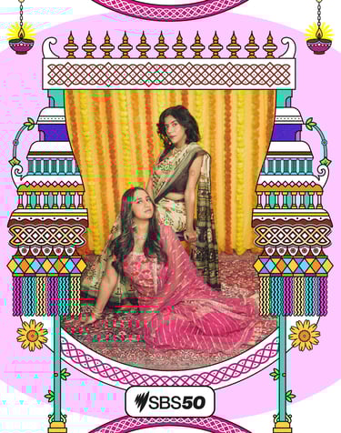
For the South Indian frame, I paired temple architecture with Kolam patterns and topped it off with a fresh zest of Diwali elements like diyas and lanterns.
I was honestly stressed about the next two frames since I wasn’t very familiar with the cultures and traditions of those countries.
But after speaking with my Sri Lankan and Nepali friends, I felt confident enough to get the job done!
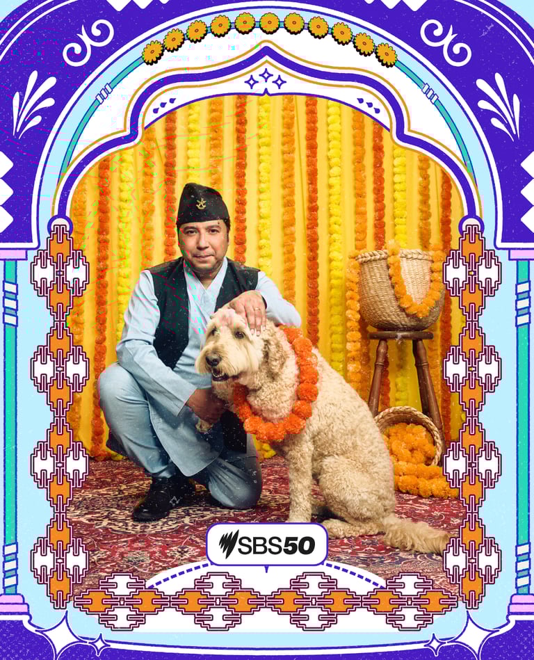
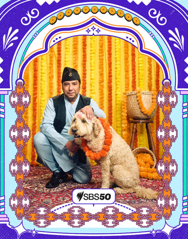
After researching the design language of Nepal, I learnt about the traditional Dhaka pattern and designed a frame that blends contemporary design with folk art.
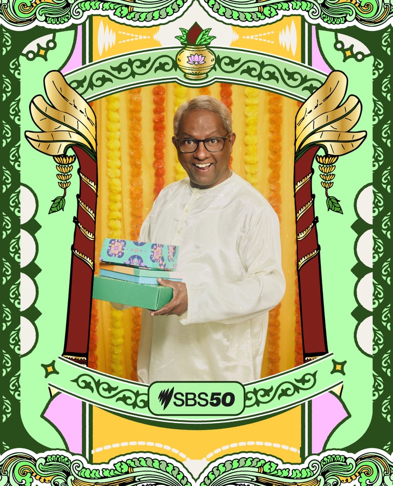
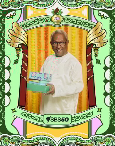
I realized that the Sri Lankan aesthetic is quite similar to the South Indian aesthetic, so I decided to use a regional motif: the banana tree. I experimented with gold gradients and hints of yellow to symbolize the richness of the festival.
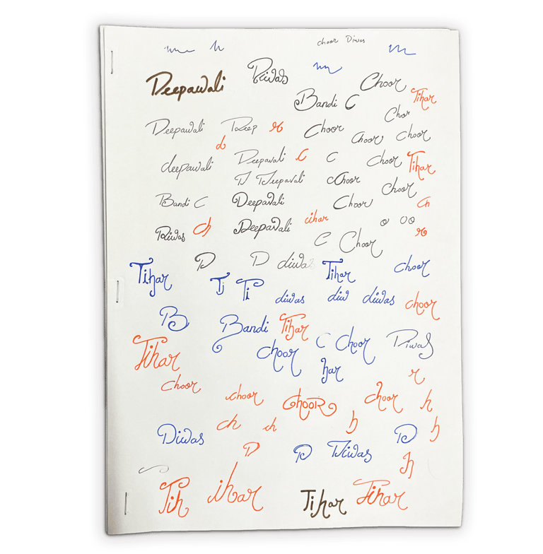
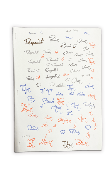
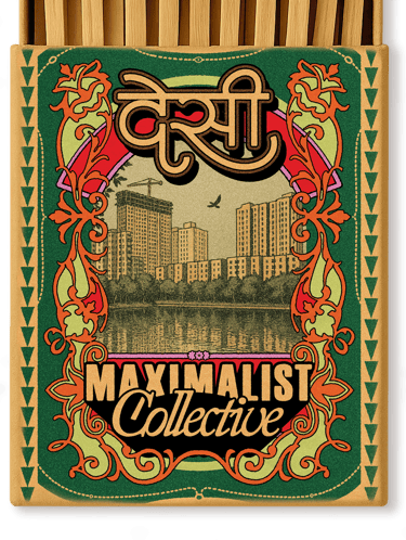
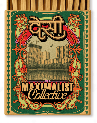
The SBS team encouraged me to go really experimental with the typography for the cover cards, so I started the old-school way:


Lettering for the cover cards:


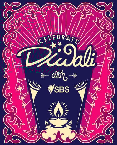
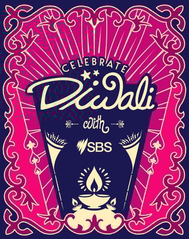
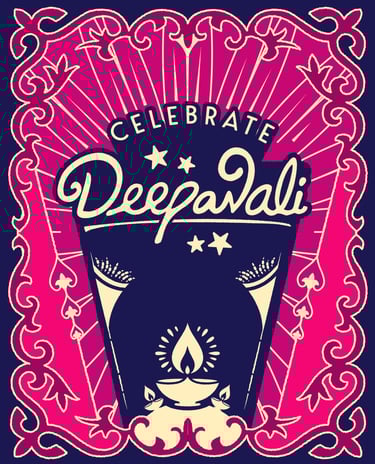
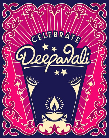


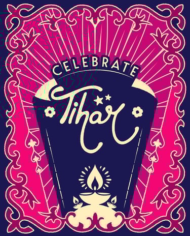
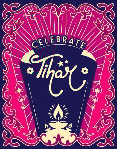
↑ Final designs for the cover cards ↑

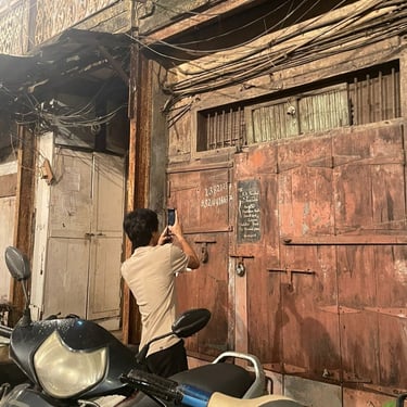
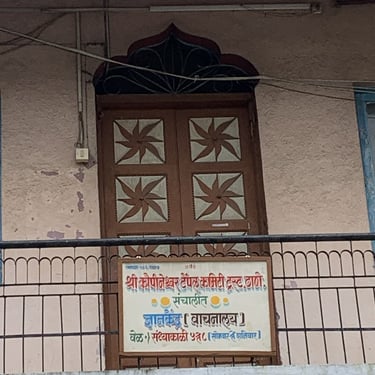
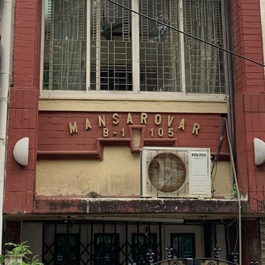
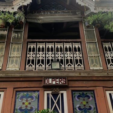
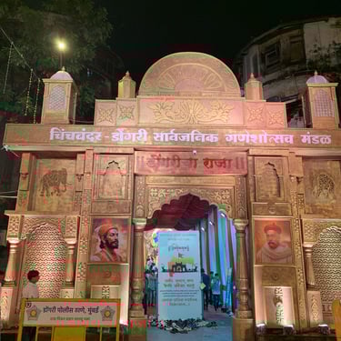


For the whole duration of this project, I was in Mumbai,India!! There was endless inspiration around me. These are some of the things I saw (typography, structures and patterns) that served as the inspiration for my designs:

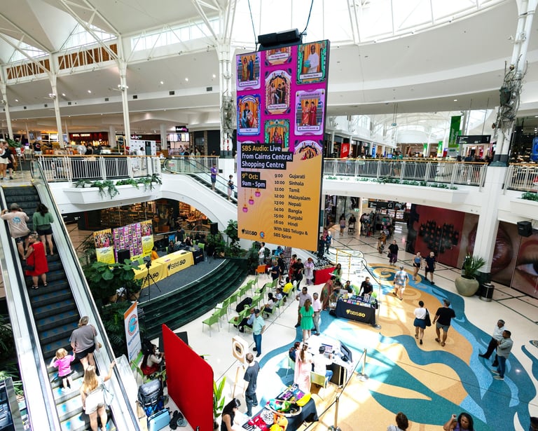
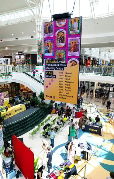
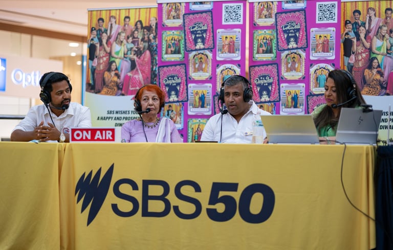
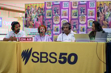
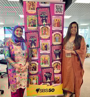
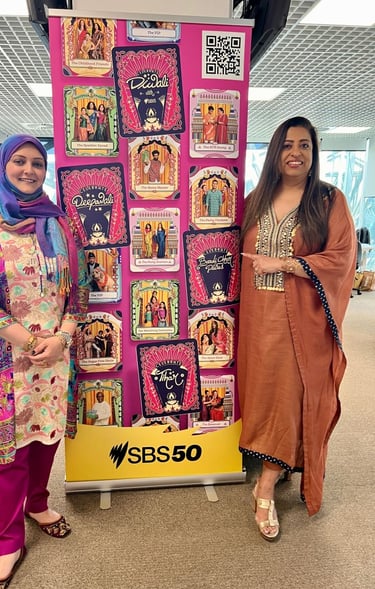
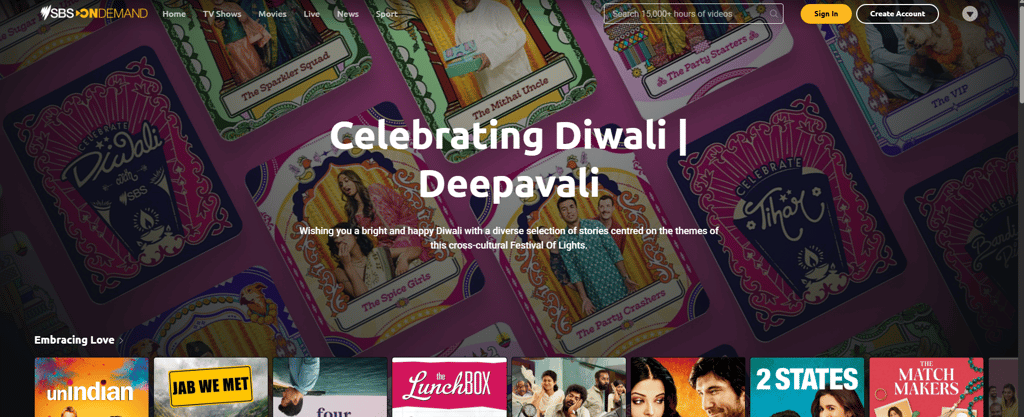
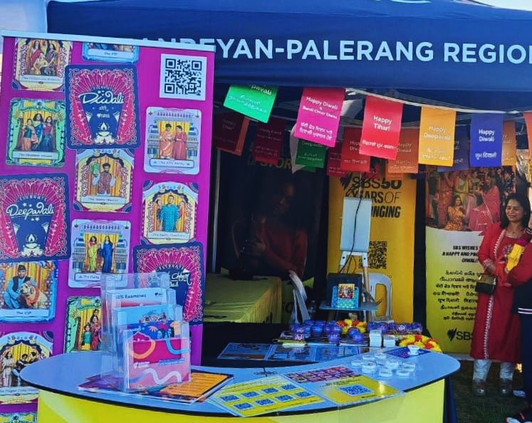
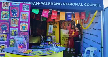
The campaign goes live!