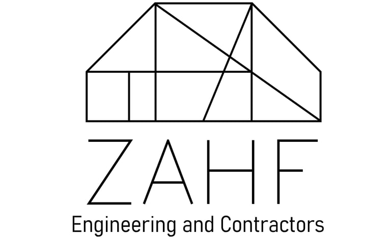
ZAHF Engineering
Collaborating with the creative expertise of AdsCult, the challenge presented in the brief was clear: construct a distinctive symbol for ZAHF that not only represents the brand but also provides a subtle hint at its core values. Through a thoughtful and iterative process, we embarked on a journey of sketching, researching, and design exploration to create a symbol that encapsulates the essence of ZAHF.
Guided by the collaborative efforts of the design team at AdsCult, a series of sketches were created, exploring various shapes and forms that could resonate with the brand. In the midst of this creative process, a shape reminiscent of a house emerged as a promising candidate. This form symbolized the foundational and nurturing aspects that align with the brand's values.
Process:
With the house shape as a starting point, the challenge was to seamlessly incorporate the letters of 'ZAHF' into the design. This required careful consideration of spacing, alignment, and visual harmony. The collaborative effort ensured that insights from both parties contributed to the development of a cohesive and meaningful symbol.
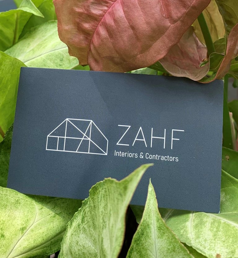
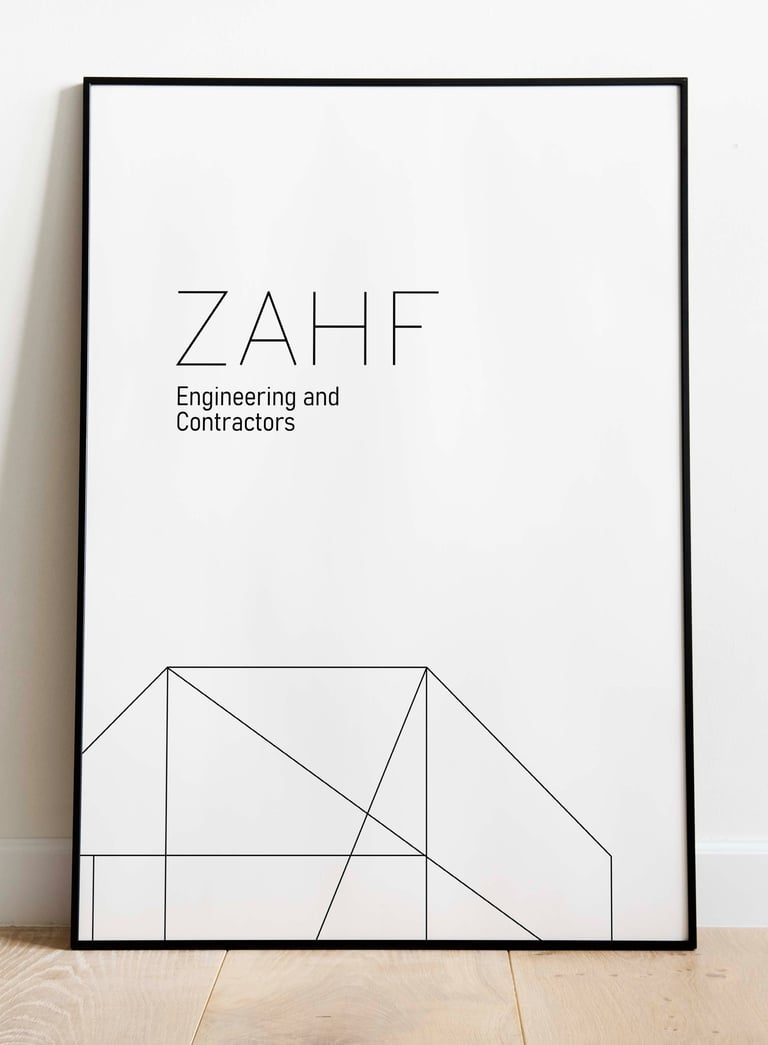
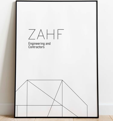
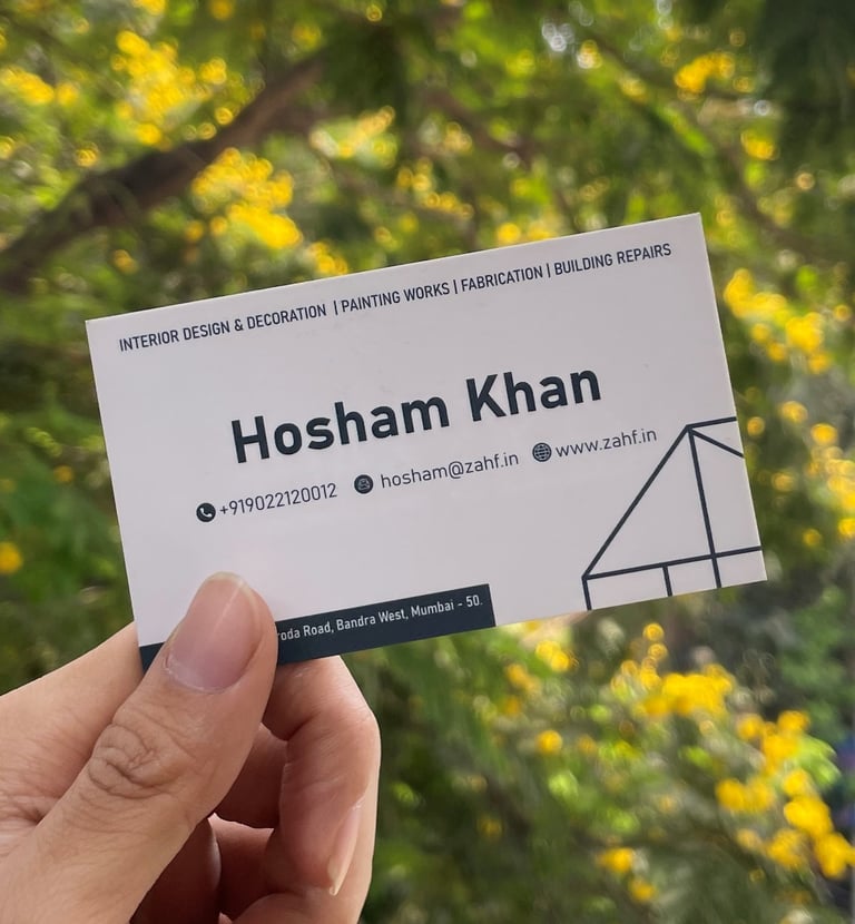
Recognizing the need for versatility, the logo was conceptualized as an extendible design system. Together with AdsCult, we ensured that the symbol could be adapted creatively across various marketing collateral such as business cards, posters, and brochures. The design's scalability and adaptability were key considerations, allowing for consistent brand representation in diverse contexts.
Extendible Design System: